The first thing you will see when you launch into the companion app is a brand new pivot with three sections: Home, Television and Recent:
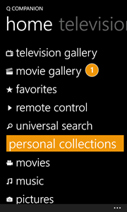
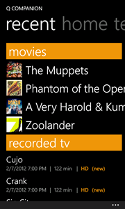
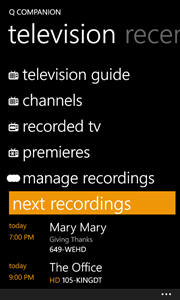
There are a couple of things to point out here. First is a very slick and clean metro feel. This includes metro icons, metro accent colors, and a non-cluttered home navigation system. We also made sure to follow the proper margin spacing. We have a ton of content inside of the companion apps and we want to make sure you can find your way around easily and efficiently.
Home:
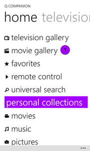
The home section is dedicated to the most important information. From your galleries and search, to your personal collection of music, pictures, videos, and more - everything is just a click away. Another key thing is that we have some live information here. If you take a look at the Movie Gallery in the list, you can see that there is a 1 next to it, which means that a new movie is available to you since the last time you checked the gallery.
Television:
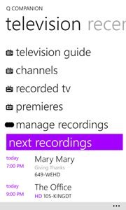
When we started designing the home screen we tried to fit everything into one page. We quickly realized that television has so many options that it really deserved its own pivot. This allows us to add more sections and areas to navigate quickly. We also wanted to make each section feel alive so, just like we have information going on in the Home pivot, we also added an area under the menu to let you know your next 3 upcoming recordings here. We think this is a nice touch so you don’t have to jump into the Recordings Management to view what is coming up tonight.
Recent:
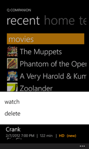
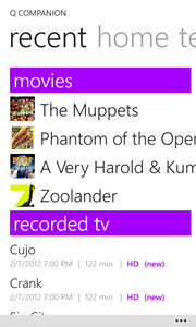
But we didn’t stop there. We have tons of information available to us and we really wanted to pull in as much information into the home page as possible while making sure it wasn’t overwhelming or hard to use. This is why we added a Recent pivot which, for right now, shows us the latest movies that were added to our collection and our most recent recordings. So you can see I just got the new Muppets movie, which is fantastic, and with one click I can navigate directly to the movie. Additionally we display your most recently recorded television episodes. In the example below I have selected Crank at the very bottom. Crank and the Menu come to the foreground while the rest of the pivot greys out and now I have the option to watch it or delete it directly from the home screen.

Theming:
You can obviously tell that we tried to pay attention to details of WP7 and metro to keep a consistent UI and make it feel like a native application. If you take a look at the screen shot below I turned on the Metro Grid Helper (via Jeff Wilcox: http://www.jeff.wilcox.name/2011/10/metrogridhelper/), to ensure proper spacing in the app:
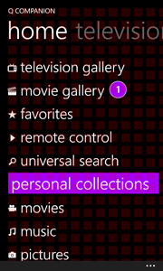
Beyond that we also have full support for the light theme as well. Here are the three pivots in the light theme with the purple accent color:
Video:
If you want a little bit more of a hands on experience I also put together a nice video:
We hope that you enjoyed a sneak peek at the new companion app home screen. Check back soon as we’ll be unveiling more and more of the companion apps including more on W8, WP7, Android and iOS!
-James Montemagno
--Software Developer, Ceton Corp.
Follow us on:
Twitter: @CetonDevs, @CetonCorp
Facebook: http://www.facebook.com/CetonCorp